
Software ads
Textmagic’s Facebook, Instagram and Google ads
- Running now
- 43
- Winners
- 30
- New in 30 days
- 0
- Average run
- 64 days
- Longest run
- 254 days
Ads running now
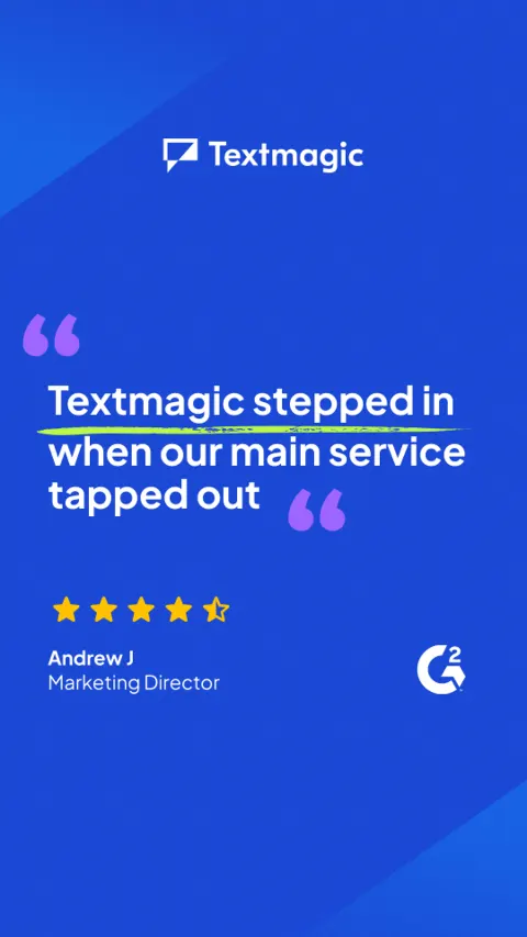 Reach Customers by SMS & Email253 days
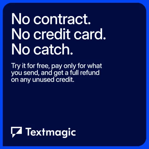 The trial that's actually free120 days
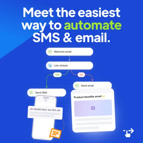 Textmagic254 days
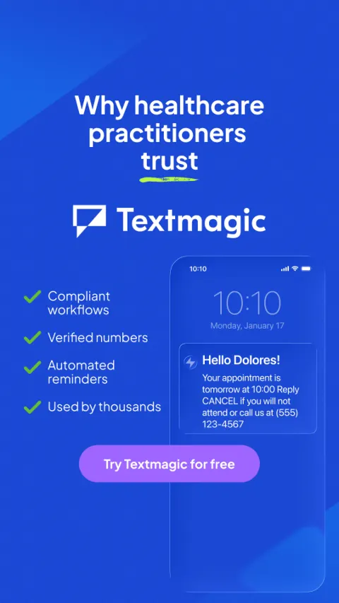 Make students feel noticed239 days
 Video86 days
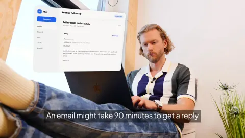 Video90 minutes vs. 90 seconds144 days
 Video142 days
 VideoThree assumptions, all wrong108 days
 Textmagic115 days
 VideoHow to Fix Internal Comms for Field Teams144 days
 Video144 days
 Reach Customers by SMS & Email152 days
 The trial that's actually free49 days
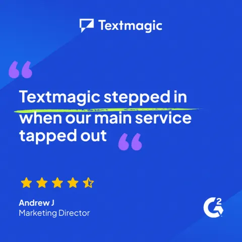 The trial that's actually free47 days
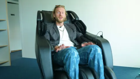 VideoNo week-long setup.80 days
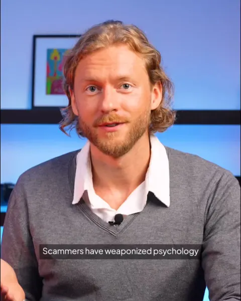 VideoSMS Scams 1 (4-5).mp481 days
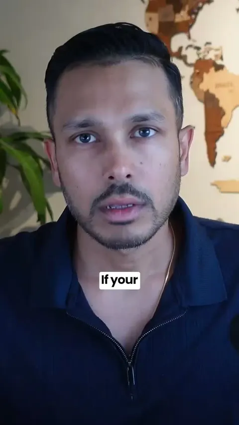 Video66 days
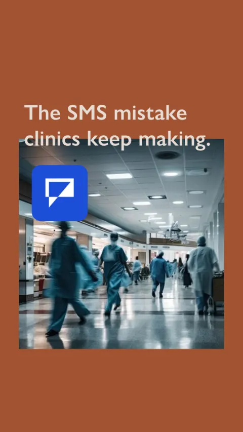 Video67 days
 VideoStill sending reminders manually?143 days
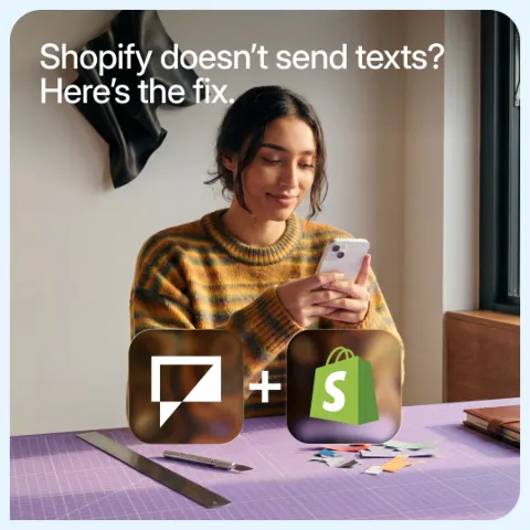 Textmagic122 days
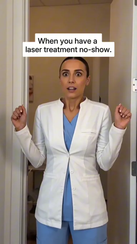 VideoNo-shows don't cost you anymore120 days
 Textmagic101 days
 VideoThe reply goes nowhere.80 days
 The trial that's actually free28 days
What it runs
- Formats running now
- Videos 26 · Carousels 9 · Images 8
- Styles
- Carousel, Listicle, Offer, Demo, Tutorial, Comparison
- Where its ads ran
- Facebook, Instagram and Google
How its best ads open
- “Still jumping between tools to message customers? Send SMS & email from one Textmagic inbox. No contracts or subscription.”
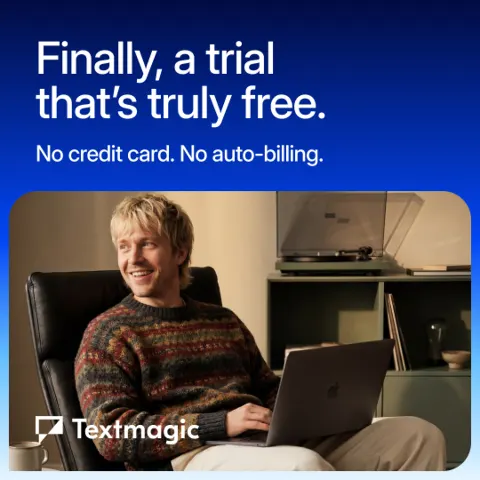
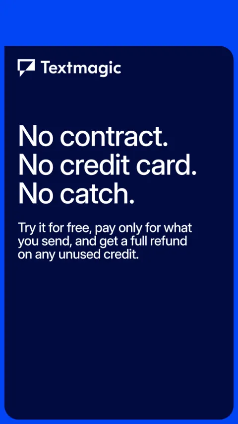
- “The free trial is actually free. No card to enter, no contract to sign, nothing to cancel later.”
- “To all the owners, operators, and message-senders.”
- “How do you stand out in the digital noise and make students feel noticed?”
- “Your Shopify customers are forming an opinion about your brand in the hours after they buy.”
Why its best ads work
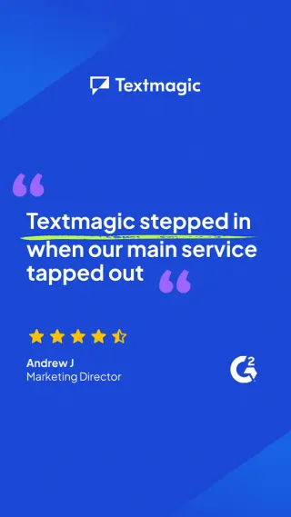
It names the annoyance of juggling separate tools to message customers, then offers one inbox for SMS and email as the fix.
It leads with a specific, relatable pain and resolves it in one sentence, so the value is clear in seconds. The 'no contracts or subscription' line removes a common objection for software buyers right before the sign-up button. The data shows it has run 253 days, is still active, and sits in a group of 13 ads with 5 live, which suggests the message has held up well over time. That is a signal, not proof of results.
- Open with a question that describes the exact workaround your buyer already puts up with, so they recognise themselves immediately.
- Pair the pain with a single, concrete fix (one inbox instead of several tools) rather than a list of features.
- Place the objection-handling line, such as no contracts, next to the call to action to lower the sign-up risk.
- Keep the headline and the post text doing different jobs: one states the outcome, the other sets up the problem and the solution.
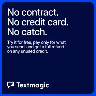
It removes the fear of hidden commitments by stating there is no card, no contract and nothing to cancel.
It goes straight at the biggest reason people hesitate to start a trial, which is fear of being charged or locked in. The three short 'no' statements are quick to scan and easy to believe. The data shows it has run for 120 days, is still active and has 5 active ads, with a win score of 91, which suggests this message has held up over time, though the data doesn't say why.
- Name the specific fear your audience has about starting, then answer it in the headline instead of burying it in the small print.
- Use a short list of concrete 'no' statements, because they feel more credible than a general promise like 'risk free'.
- Follow the reassurance with a one-line explanation of how pricing works so the free offer doesn't feel like a trick.
- Keep the call to action low commitment and match it to the promise, so the button reinforces the message.
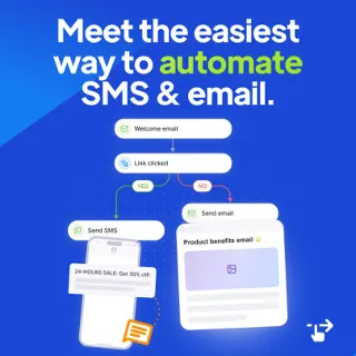
Small business owners lose hours to repetitive follow-ups, and the new Workflow Automations feature gives that time back.
It leads with the reader's frustration and identity rather than the feature, so the product arrives as the answer to a problem they already feel. The feature list uses a 'feature 👉 benefit' pattern that is easy to skim and answers the usual objections (too technical, too slow to set up). The data also shows it has run for 254 days, is still active, and sits on 5 live ads out of 9, which suggests the advertiser keeps investing in it, though the data doesn't say why.
- Open by naming your audience and their role so the right people feel spoken to straight away.
- State the pain in the reader's own terms, such as what they never wanted to spend their day doing, before introducing the product.
- Pair each feature with a one-line benefit so skimmers get the value without decoding jargon.
- Pre-empt the 'this will be complicated' objection with phrases like 'no coding' and 'ready-to-use templates', and end on a short, memorable promise.
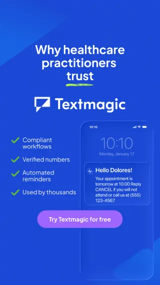
Mass emails get ignored and students feel like just a number, so a personalized text is the way to cut through the noise and connect.
It leads with a pain the audience already feels and pairs it with an emotional payoff (students feeling noticed) rather than a feature list. The copy is short and plain, and it contrasts a familiar failing channel (mass email) with a simple alternative. The data shows it has run for 239 days, is still active, and sits across 6 live ads in a set of 10 and five placements, which suggests the advertiser keeps backing this message.
- Open with a question that names the audience's exact frustration so the right people self-select.
- Frame the product against the channel they already use and distrust, so the switch feels obvious.
- Sell the human outcome first (feeling noticed) and keep the efficiency benefit as a secondary line.
- Keep the body to a few short sentences ending in a single, friendly action phrase.
More software brands


Make ads like these for your brand
Paste your website. Adwright studies the ads winning in your niche, then makes ads in your brand, ready to post.